



What Mat Color Should I Choose for My Artwork?
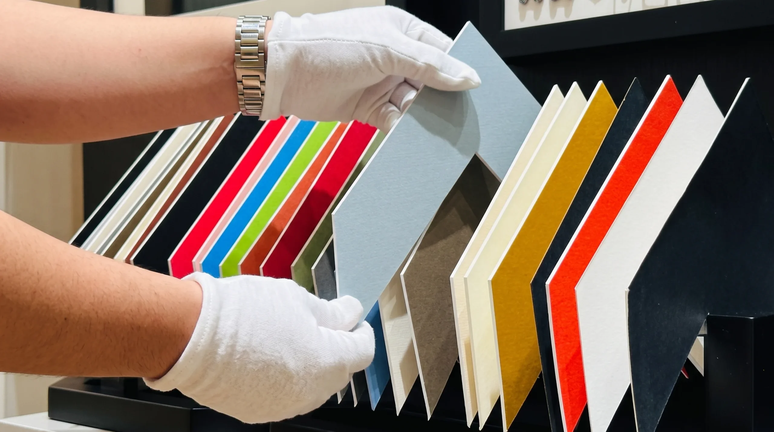
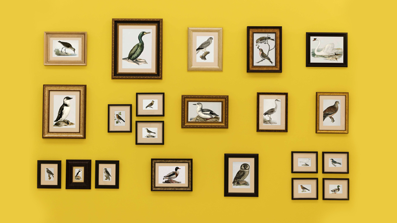
Choosing the right mat board color can make a big difference to how framed artwork looks. A mat creates space between the artwork and the frame, helping the image stand out while giving the overall presentation a clean, balanced appearance. The right color can highlight details, complement the artwork and connect it with the surrounding frame.
At Qube Art Gallery, custom framing allows you to choose matting options that suit your artwork, frame and interior. Whether you are framing a photograph, painting, print or limited-edition artwork, understanding how different mat board colors work can help you make the right choice.
What Mat Board Color Should You Choose for Your Artwork ;
The best mat board color depends on the colors, style and subject of your artwork. A good choice should complement the image without taking attention away from it.
White and off-white mats are popular because they create a clean, simple border around many types of artwork. They work particularly well with photographs, colourful prints and contemporary pieces. Neutral shades such as cream, beige and light grey can create a softer appearance.
Black mats can provide a strong contrast, making them suitable for black-and-white photography, bold graphic prints and certain contemporary artworks. If your artwork already contains strong colours, a neutral mat can help maintain balance.
Before choosing a color, consider the artwork as a whole. Look at its dominant colours, background and finer details. The aim is to select a mat that supports the artwork rather than competes with it.
Should You Choose a White, Black or Neutral Mat Board Color
White, black and neutral mat board colors each create a different visual effect. Understanding these differences can help you choose the right option for your artwork.
White mat boards:
White creates a bright, clean border and gives artwork room to stand out. It is a versatile option for photographs, prints and modern artwork.
Black mat boards:
Black creates a stronger visual contrast and can help define the edges of an image. It is often suitable for black-and-white photography, dramatic artwork and bold compositions.
Neutral mat boards:
Cream, beige and grey offer a softer alternative to pure white or black. These shades can complement artwork with warm tones, muted colours or traditional styling.
There is no single mat board color that works for every piece. The best option depends on the artwork, the frame and the appearance you want to achieve. Comparing a few samples beside the artwork is a useful way to see which color works best.
How Does Mat Board Color Affect the Look of Your Artwork ;
Mat board color influences how people see the artwork within its frame. It can create contrast, highlight certain colours and affect the balance between the image and its surroundings.
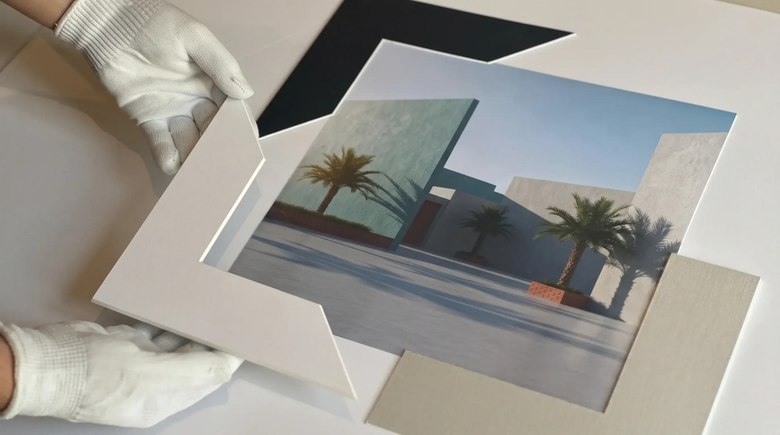
A light-coloured mat can make an artwork feel open and spacious. It creates a clear separation between the image and the frame, which can be especially helpful for detailed photographs or colourful prints.
A darker mat can create a more dramatic presentation. It may draw attention towards the centre of the artwork and work well with images that have deep shadows or strong contrast.
The width of the mat also matters. A wider mat can give the artwork more visual space, while a narrower mat creates a closer connection between the image and frame. The right combination of mat color and width helps create a balanced finish.
For valuable or delicate artwork, the materials used in the mat are important too. Acid-free, conservation-friendly materials can help reduce the risk of damage caused by unsuitable framing materials. Learn more about conservation framing at Qube Art Gallery.
Should Your Mat Board Color Match Your Artwork or Frame ;
Your mat board does not need to match the artwork or frame exactly. Instead, it should complement both and create a visual connection between them.
If your artwork has several colours, you can choose a mat that picks up a subtle shade from the image. This can help tie the composition together without making the border too noticeable.
When working with a wooden frame, a cream or beige mat may complement warm wood tones. A white or light grey mat can work well with many black, white or metallic frames. However, the artwork itself should remain the main consideration.
You can also use contrast intentionally. A dark frame with a light mat creates a defined border, while a lighter frame with a neutral mat can produce a softer look.
The best approach is to view the artwork, mat samples and frame samples together before making a decision. At Qube Art Gallery, custom framing gives you the opportunity to consider different framing combinations to suit your piece.
Where Can You Get Custom Mat Board Colors in Dubai;
Choosing a mat board color can be easier when you can compare different options alongside your artwork and frame. A professional framer can help you consider the color, width and material of the mat to achieve a suitable finish.
At Qube Art Gallery, custom framing services help you select framing options based on your artwork and presentation preferences. Whether you are framing a family photograph, a fine art print, a painting or a special piece, the right combination of matting, frame and glazing can make a difference to the final result.
You can also explore mounting and matting services to learn more about the options available for your framing project.
Visit Qube Art Gallery in Dubai or Abu Dhabi to discuss your artwork and explore suitable mat board colors for your custom frame.